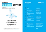
Impressions over the Data-driven Visualization Symposium
Today I was attending an event entitled “Data-driven Visualization Symposium” in the beautiful Trippenhuis building of the KNAW in Amsterdam. There was a really rich schedule with 10 speakers showcasing some of their work in the area of big data and visualisation.
Though I would have appreciated getting a bit more of the how instead of just seeing finished products, I really enjoyed the presentations. Using two very different application domains (respectively the design of logos and the exploration of massive data), Wouter van Dijk and Edwin Valentijn showed cases where information overload can be dealt with by using clever reduction techniques. The data has to be turned into something more communicative and be part of our interaction schemes, among other social, mediated and IoT interactions. But at the end of his presentation about an atlas of Pentecostalism, Richard Vijgen also rightly reminded us to be very cautious when bringing data to an audience which has not received the critical thinking training researchers receive. This population may take everything we depict for granted without questioning the graphical representation. Mirjam Leunissen followed up on this idea when showing cases of Fox News and the Utrecht University doing visuals that trick the reader (e.g. 6M depicted graphically as 2/3 of 7M). Her talk was about how visuals can be either used to convey the numbers or convey an emotion/impression, the later being more used by data journalists. She pointed to several great examples of impression rich visualisations including a view of the number of Syrian refugees, gun deaths in the US, the depth at which black boxes of a lost flight are expected to be found. To complete the showcasing of applications, Timo Hartmann and Anton Koning explained how visualisations can be used for collective decision making and mediated interactions in the civil engineering and medical domains.
In contrast to these port-folio presentations, Laurens van der Maaten and Elmar Eisemann gave two more technical talks respectively describing the t-SNE algorithm for visual clustering and explaining how common gaming techniques (frustum culling, LOD, ray tracing, …) can be combined with more advanced tricks related to the eye sensibility to provide high throughput, personalised, rendering. These techniques have been applied for rendering flooding models in the project “3DI”. A remote rendering cluster is used to ensure high-end graphics can be processed and shown on lower grade hardware.
Last but not least, Maarten van Meersbergen and Tijs de Kler gave an overview of what the eScience center has to offer in terms of hardware and expertise, welcoming the participants to make good use of both to crash test their data as early and often as possible.
As hinted a bit earlier, what I missed the most was more explanation and guidance about how to find the best way to convey a story with visual representations. Maybe also with a bit more information about the tooling to use. I also missed seeing visualisations using Wii-Us but that’s a different story 😉 Right now, I do not have a much more clearer idea on how we should visualise our census data from CEDAR than I had before attending the symposium… let’s see whether something pops up later when thinking more about everything that was shown today 🙂

